A Fresh Look for Symphony’s Next Chapter

Since we launched Symphony in 2014, we’ve been continuously evolving: introducing new features, inviting our customers to collaborate in person at our Innovate events, launching Symphony Market Solutions, and more.


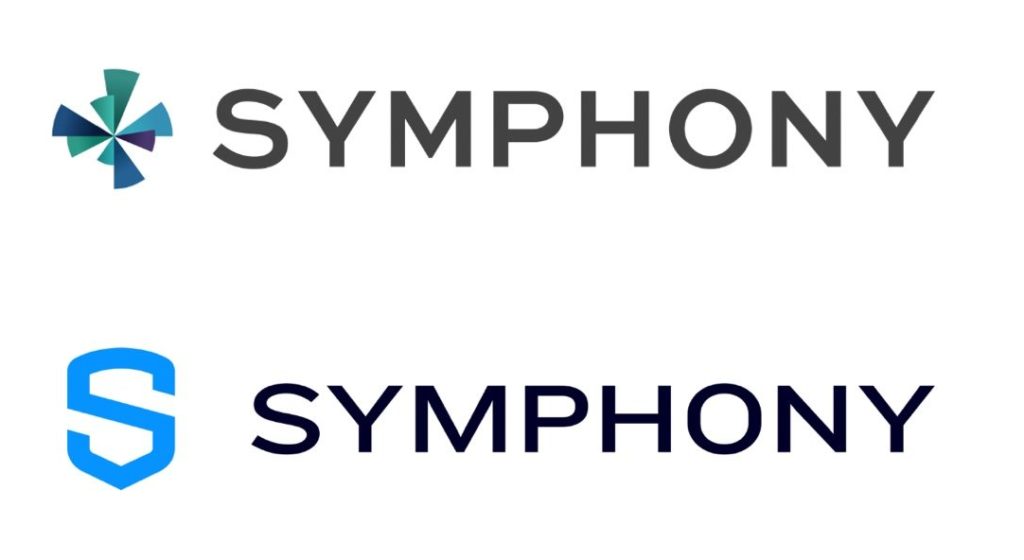
As we look ahead to our next chapter, now is the perfect moment to refresh the logo and overall look of Symphony. Our original logo introduced us to the world and represented our brand during the company’s early days. Its multicolored pinwheel design was a reflection of the consortium that worked together to launch Symphony: 15 disparate financial institutions collaborating to solve a common problem with how their organizations were communicating.


Five years later, Symphony is still the same solution, but we are not the same organization. Symphony has grown – not only in terms of our size but in our experience and vision as well.


Our new logo proudly represents the company we are today. Visual elements of a shield, a padlock, and the letter ‘S’ speak to our company’s identity and reflects our core values. We designed this logo to be an emblem of privacy, security, and trustworthiness (with a few superhero vibes). Last but not least, its clean, simple aesthetic reflects the modern, sleek Symphony of today:

A Fresh Look for Symphony

You can expect to see our new logo on the redesigned Symphony website and within the Symphony product in the coming weeks. This change is the first in a series of forthcoming updates and announcements we’ll be sharing this October at Innovate 2019. We’re looking forward eagerly to our next chapter, and are excited to raise a glass in celebration of our fifth anniversary, our new look, and much more.

You may also like