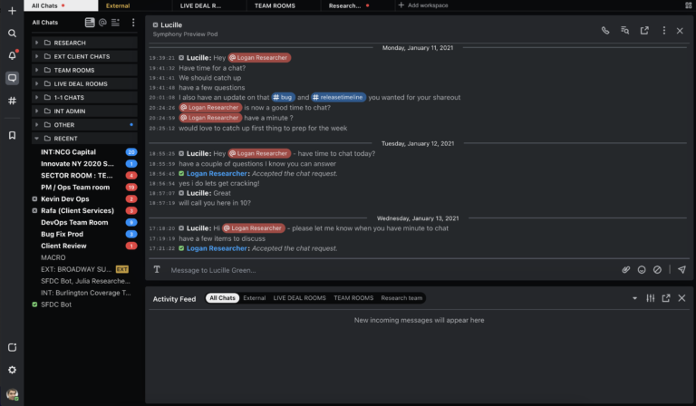
Since introducing Symphony 2.0, we’ve shared blogs on a few different elements of the product: from the accompanying mobile app, to the guiding principles of its development, to new features like workspaces. We’ve noted before that user input, feedback and usage data played a significant role in shaping Symphony 2.0. Recently, we hosted a webinar to share these user insights and show the Symphony community why we built 2.0 the way we did–as well as demo some of the features inspired by customer feedback:
1. More ways to customize Symphony
We often hear from Symphony users that they want a customizable experience; however, our analytics revealed that 60% of end-users were sticking with standard, “out-of-the-box” configurations of Symphony. So now in Symphony 2.0, users can choose between two modes, each with their own default settings: Essential Collaboration mode and Capital Markets mode. This way, users can benefit from the settings we know they are looking for without having to lift a finger while still maintaining the ability to customize.
For those who did take the time to customize their settings in Symphony 1.5, the results were impressive. During a “floorwalk” session where we observed how customers were using Symphony, our conversation with a user in a front office sales role was interrupted by a laser blaster sound effect from his computer. Without looking at his screen, the user explained that based on the noise alone, he could identify the sender of the message and the room in which it had been sent–and take action to respond immediately. To make this even more powerful, we’ve also introduced more granular controls at the conversation level, making it easier to customize colors, sounds, and notifications according to each user’s unique preferences, so users never miss their most important messages.
2. Notifications that differentiate the signal from the noise
We spoke with hundreds of users about what sort of notifications they needed, in what instances, and why–we quickly learned team members sitting in the same sales desk had unique notification preferences! What they have in common is that they all want an easy way to elevate certain alerts and tone down noisy conversations. Additionally, analytics informed us that one of the most commonly utilized notifying mechanisms is the @mention Based on these insights and feedback, we built a new notification center for Symphony 2.0, evolving the @mentions module to an all-encompassing central location to unify all notifications.
This new interface, as well as new customization preferences such as starring, and urgent chat alerts help users elevate notifications to be powerful enough to alert them of important messages, but prioritized appropriately to avoid distracting them with general chatter.
3. New ways to organize multiple chats and conversations
Symphony users are multitaskers. Many users in Symphony 1.5 relied heavily on their inbox and folders within the platform to stay organized and so they could prioritize tasks for the day. But we also observed that most users found it difficult to monitor multiple conversations on a single screen so they packed as much information into as small of a space as possible. The need to maximize screen real estate is key for our users, so we wanted to give them the flexibility to monitor chats with the smallest footprint possible.
To solve this challenge in Symphony 2.0, we created workspaces. Users now have the ability to create a grid for every workspace, allowing them to organize and monitor chats so they can keep track of conversations and multitask seamlessly. Symphony 2.0 also offers users the ability to easily pop out different workspaces, activity feeds and chats to segregate layouts based on the tasks at hand.


